Who needs advice on the most readable font typefaces for print text? Choosing a typeface for text seems like a no-brainer. Design is often focused on the eye-catching label, the attention-grabbing cover. But in reality, choosing a readable font typeface is one of the most challenging decisions of graphic design.
Print text refers to the columns of words and sentences in printed materials like brochures, books, newsletters, magazines, etc. What is readable on a computer differs from printed output. A readable font typeface for printed text can mean the difference between a short-term grab and long-term memory. Readability and legibility are top criteria for a designer of print layouts. The effectiveness of any printed text rests on how easy it is for the eyes to scan and comprehend content. Readable font typefaces makes this possible.
A readable typeface for print is built on solid principles of design. Updated cuts are then worked by master typographers and font designers. The following are considered the most readable font typefaces for printed text, with several further than this list. Most are serif typefaces, with a few sans serif font families. New designers may dismiss them as too familiar at first, but return to them eventually:
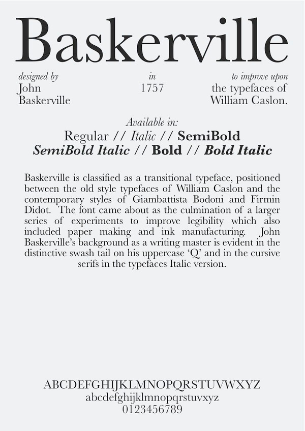
Baskerville, designed by John Baskerville
Typography poster by Andrew Henderson
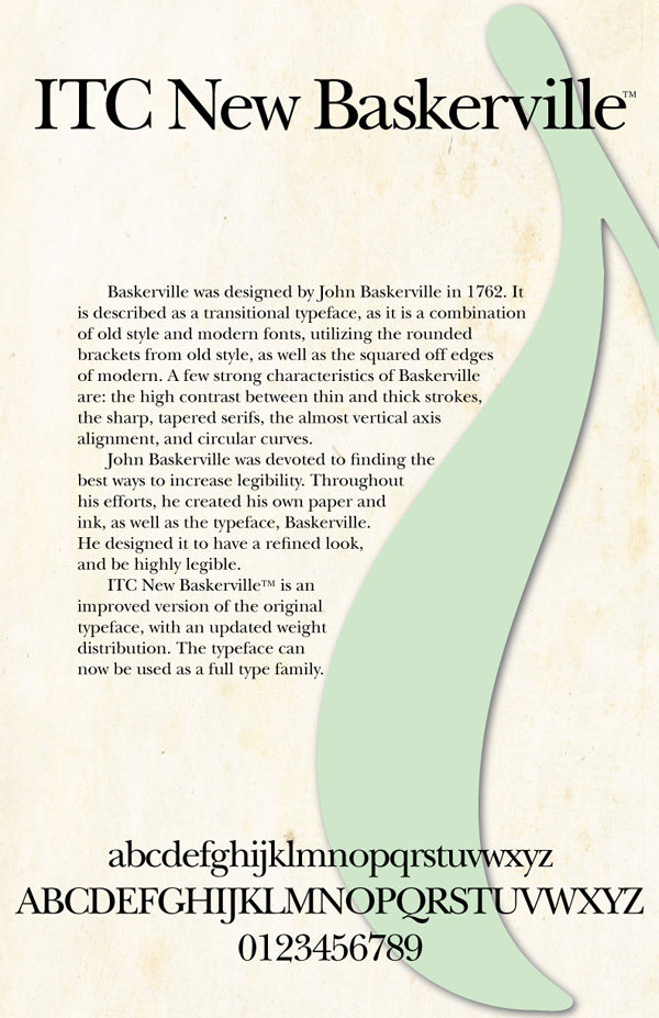
ITC New Baskerville, designed by John Quaranda
Typography Poster by Strange
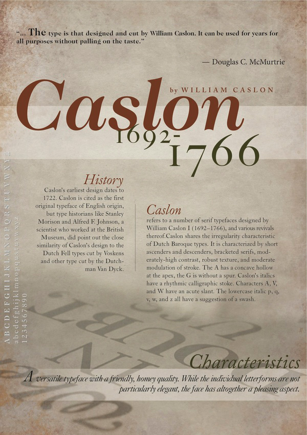
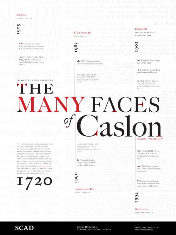
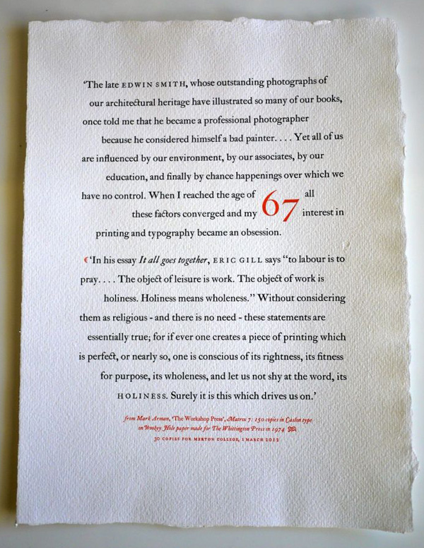
Caslon, designed by William Caslon
Typography poster by Eunice Chan
Typography poster by Shawnacy Ruffin
Typography specimen from Whittington Press – photograph by Tony Geer
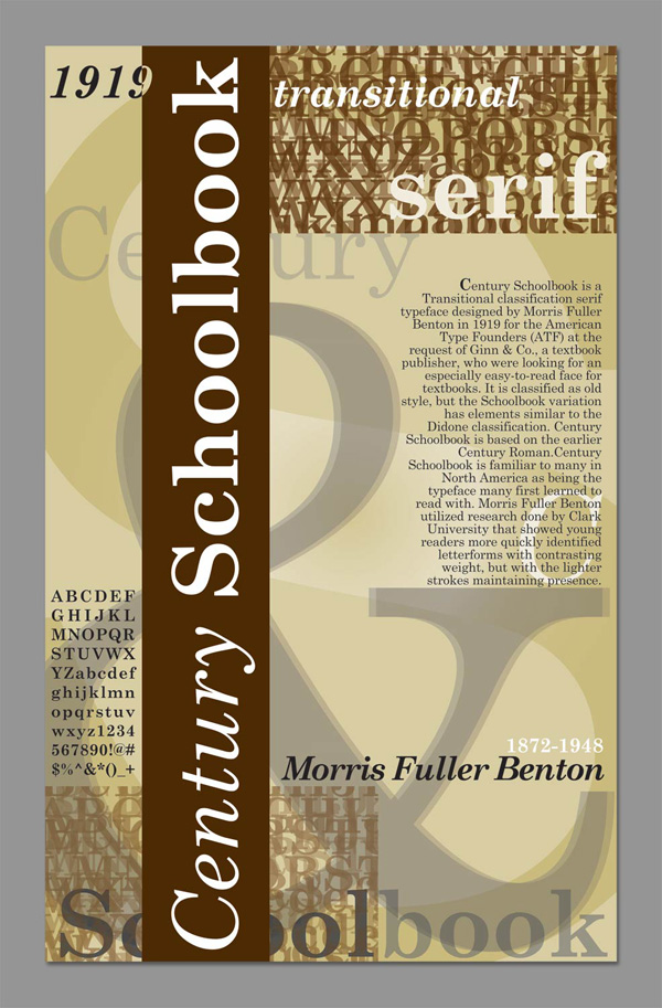
Century Schoolbook, designed by Morris Fuller Benton
Typography poster by Adrienne Saldivar
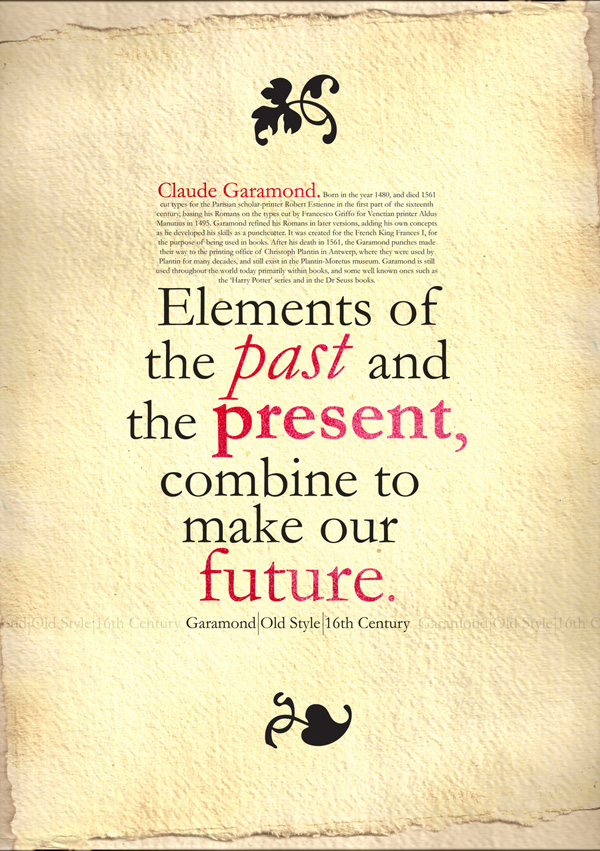
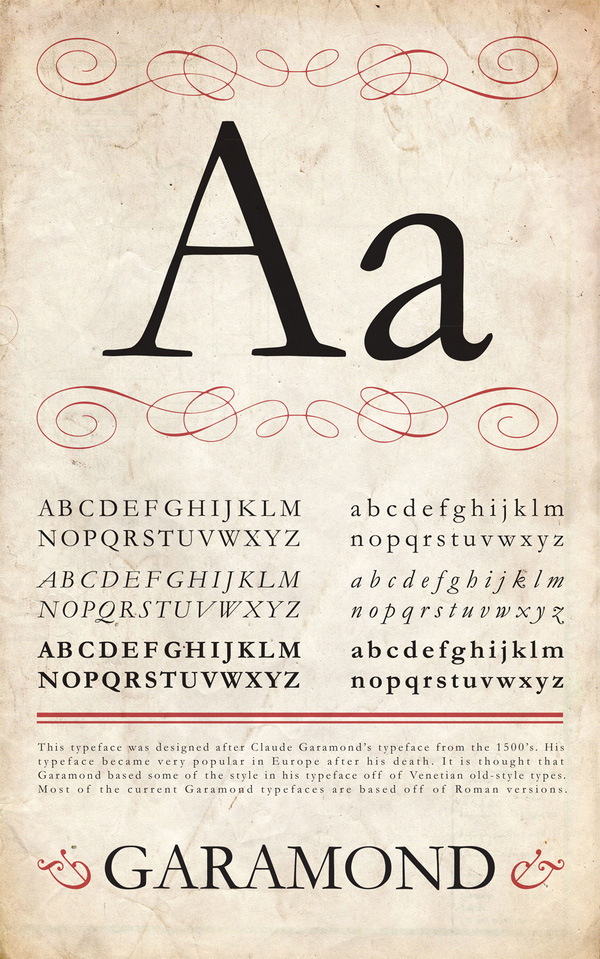
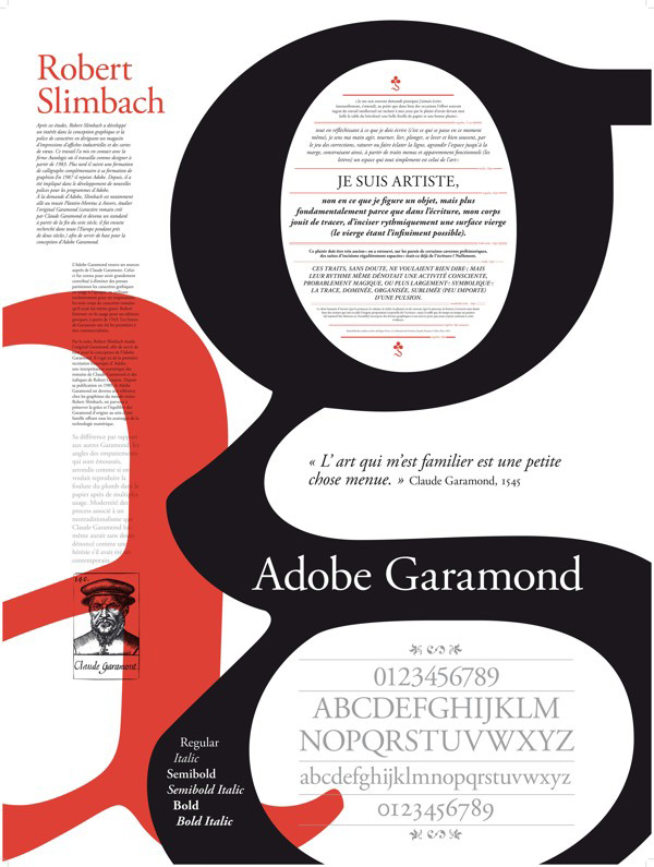
Garamond, designed by Claude Garamond
Typography poster by oBrokenoRoboto
Typography poster by Hope Tweed
Adobe Garamond, designed by Robert Slimbach
Typography poster by Melaine Top
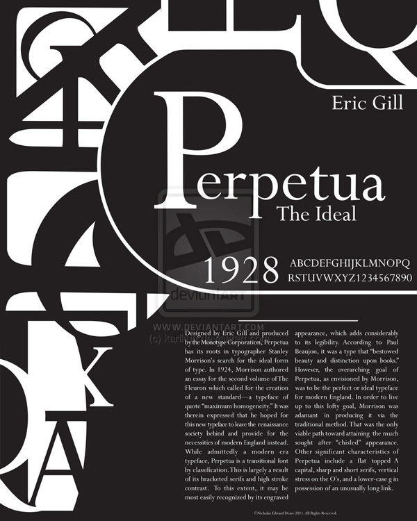
Perpetua, designed by Eric Gill
Typography poster by karikun
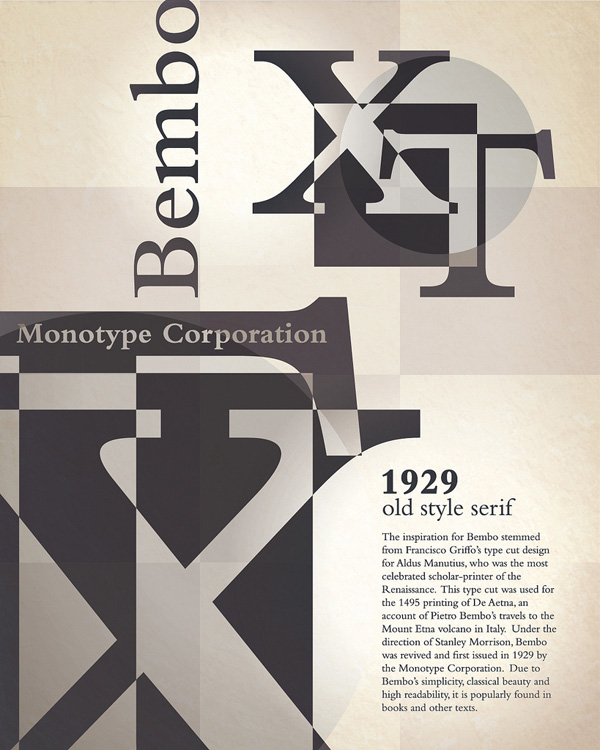
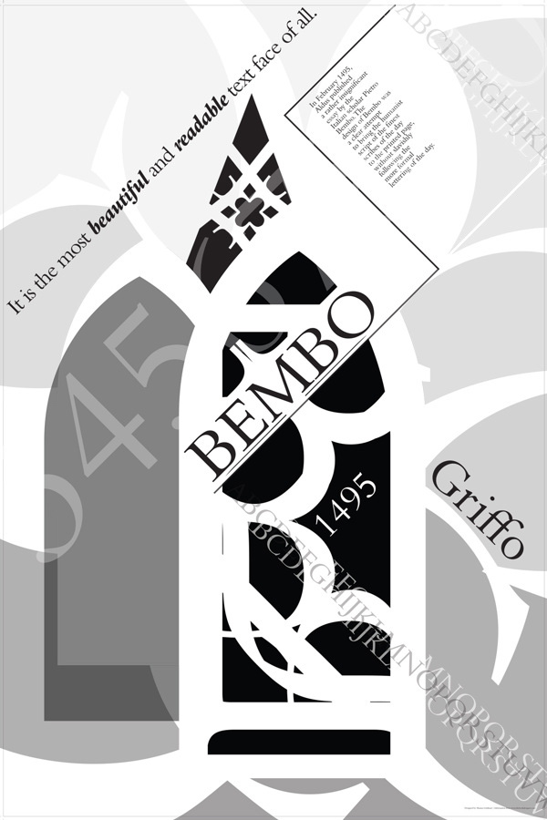
Bembo, redesigned under the direction of Stanley Morison, from the typeface by Francesco Griffo
Typography poster by BigJaz32
Typography poster by Shauna Goldman
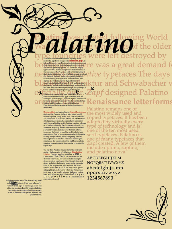
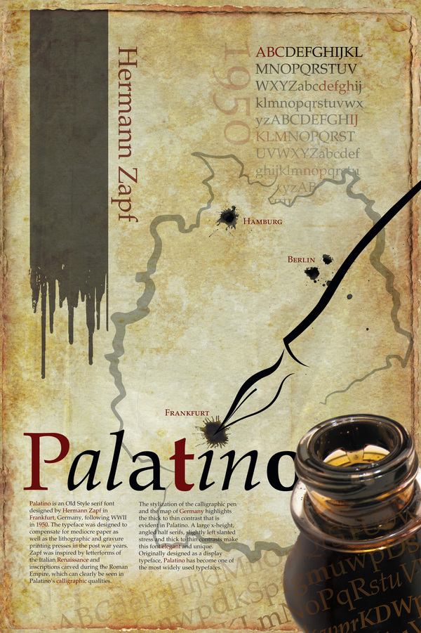
Palatino, designed by Hermann Zapf
Typography poster by theStrange6
Typography poster by Timothy Mara
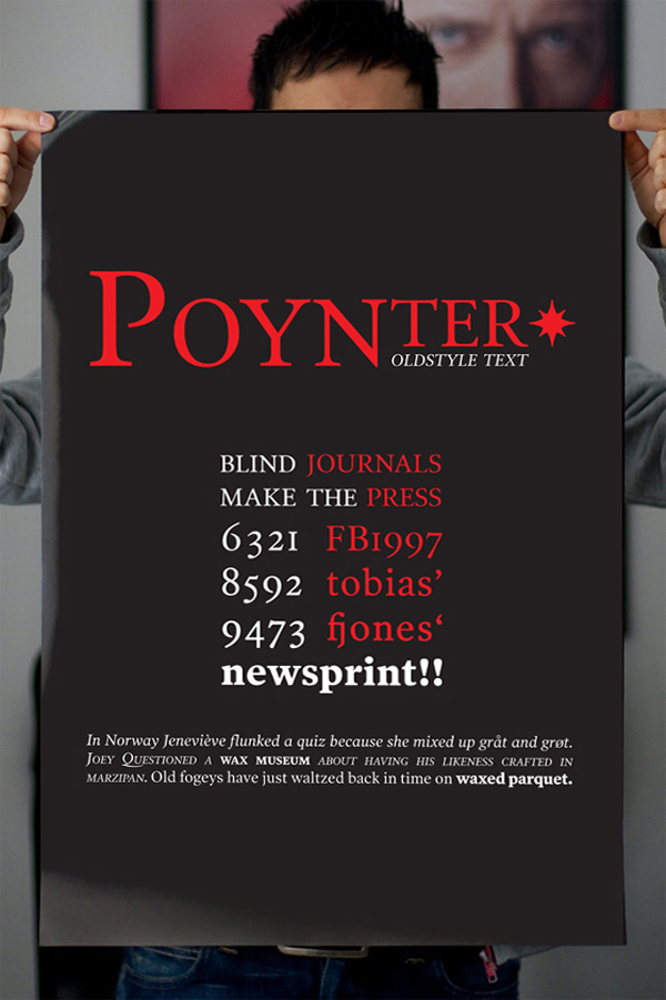
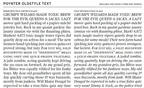
Poynter Old Style Text, designed by Tobias Frere-Jones
Typography poster by Daniel Marques
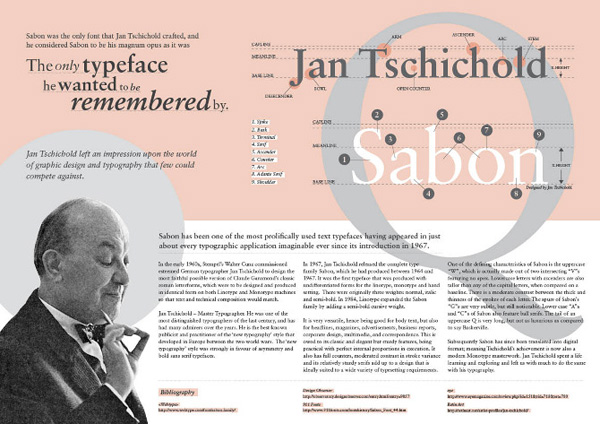
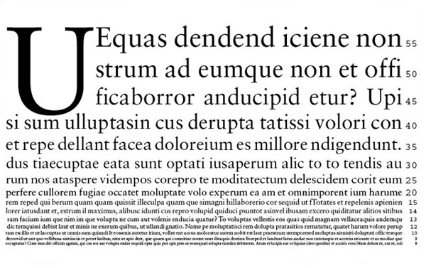
Sabon, designed by Jan Tschichold
Typography poster by Chica Yoshida
Sabon type specimen by Helzdesign
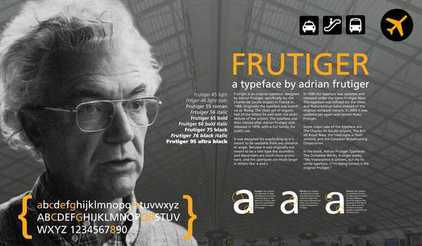
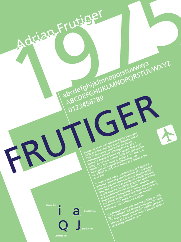
Frutiger, designed by Adrian Frutiger
Typography poster by Cale LeRoy
Typography poster by lludu
Futura, designed by Paul Renner
Typography specimen posted by maijaahonen

When we use a readable font typeface for print, we have access to all its fonts. Not just one. A typeface is a whole family of fonts. A readable typeface includes real italics, various weights like light, medium, bold, heavy, condensed, etc. And with OpenType features, you will also have access to unique styles called glyphs.
Some of these typefaces may sometimes not look as crisp on screen as you would wish. But in print text these readable font typefaces appear in all their glory. There’s a reason why they are called classics. They translate well to deliver modern messages without looking like they belong to a retro era.
Are there free font typefaces that are as readable for print text? Surely with all the beautiful free specimens available? Most of us collect free Web-friendly fonts by the hundreds. Then scale down to less than 50 for the really good ones. But studies, experience, and printing presses have shown that for print materials, the most readable font typefaces are still the classics, or some of their updated versions. Perhaps you already have some of these typefaces. If you don’t, they are worth purchasing if you intend to produce design layouts for print.